Friday, 27 April 2012

Final- Life Drawing


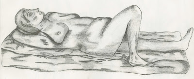
Here is a 2 hour Final Life drawing done in pencil. The primary focus in this image is on the posture and pose of a life model. Weight distribution over the soft surface the model is using is also a key feature that is used to help establish light. The proportion is slightly off in areas such as the leg where it seems very elongated compared to the rest; however the surface material helps lower the awareness by questioning the perspective. The tone of the image is to signify where the light is illuminating from. This also connotes the muscle structure of the model and how their body mass effects where tone is established.

The overall body layout is very loose and open allowing for a clear establishment around the model and the different levels of tone. The surface is interesting to place with the model, not just so it doesn't seem as if the model is floating in the air, but it helps build characteristics of the model, showing where weight distributes and how this affects the outcome of the image.

With more time the tones could be slightly improved by allowing more of a flow with in the different levels, to show that if an area is darkened out almost, that it fades into another tonal level close to this rather than just a completely different tone conveying uncertain tone. The shading from the surface material, particularly around areas such as the right foot, also helps to fortify the structure of the model allowing it to look more bold.
Final- Still-Life Drawing


Here is an hour and 45 minute Final Life drawing from an original 30 minute drawing, of a single still-life set up, chosen from a variety of different shaped an sized objects. The main focus is on the composition and arrangement of the objects included. There is an implied line established from the line of objects in height in order from front to the back. This conveys the audience into the focal point in then center where the three objects contrast against each other.

The shading in this drawing, particularly around the small glass container, coveys how light reacts to different surfaces such as glass and metal. It helps the viewer understand that its not an opaque object but a transparent one. The shading gets darker where the two objects behind it are visible and is very bright where the light travels through without hitting anything. However in other areas such as the tall vase, may have been slightly overcompensated when concerning the shading around the neck, though in turn with the use of a rubber tried to amend this slightly.

Carrying on from that, the perspective is difficult to esablish due to the uncertainty of the small glass container, the line seems to edge closer to the back, leading the audience into a false acknowledgement that its slightly off hand. The high values of tone and shadowing on the tall vase emulate its characteristics against the lesser smaller jug, the tone also implies depth within the objects.

Final- Landscape Drawing


Here is a Final Landscape drawing done in watercolours on damp paper. The focus was on colour and how it is visually established through landscape. The image represents a focal point facing straight down a canal which therefore a sense of fore-shorting and perspective. The base of the painting was an already damp piece of paper which has dried in some colours that were replace with darker tones to convey the 'wetness' of the location.

The perspective is off in the lower pavement of the image as the square concrete slabs are too upright and don't flow well with the rest of the image, however the different combinations of colours in the water bring out an effective establishment of colour. The brush was used effectively to signify such a fluid appearance. This is also present in the trees; the thin strokes establish the wind blowing creating a sense of escapism into the piece itself.

The shading is also quite effective in this image as it really connotes a damp, miserable feeling around the piece that helps bring out the feeling of the strokes. Also instead of keeping a linear reflective pattern on the surface of the water, the brush strokes were hardened here to establish the hectic weather.


Week 12: Natural Landscapes in colour- Quick Sketch


This is a 20 minute watercolour painting using dark toned water based paints. The main focus was on colour within an outside environment. The archway had great tonal values that contrasted well, even more so due to the damp and wetness of the stone. The stone slab contrasted with the upper wall conveys how the light was only piercing through very slightly, but is more established with the right side being lower in tonal value than the left.

The focal point sees straight through esablishing perspecive and a sense of a background, middle ground and foreground. In the foreground the colours are more darker than in the background further dignifing light. The tree that is also visible in the background is slightly out of perspective and proportion with the rest of the image. This was due to the amount of greenery in the background therefore this establishes an interruption between the tree and the ground below.

Sunday, 22 April 2012

Week 11: Colour in landscape- Finished Drawing


This is a 40 minute drawing done in coloured pastels. The main focus is on colour in landscape. The location is noticibly dull therefore colours were chosen to further this damp boring appearance. A vantage point was chosen that used the rule of third to a good advantage. Shadow and tone value are also very important within this drawing. As is the use of different tones of green for example, help establish the different layers the grass has when wet. It shows how the light an dark tones contrast well together.

The building in the background, lost its detail with the weather. its blank dullness tone, conveyed a simple yet forgotten establishment. The light also helps convey this, as because it is so dull, the background is represented as much more duller and darker than the foreground with the bright green, to contrast the two to make a ranged layer of depressive colours.

Sunday, 1 April 2012

Week 10: Classical Architecture- Quick sketch 2


Here are a couple of 30 minute sketches completed in pencil. It establishes a high vantage point in one of the balcony's, chosen for its unusual angle facing away from the stage an towards the back of the room. The center of the image focuses on the curve which straight away entices the audience's eye to follow. The perspective reveals the hundreds of chairs lauded on the ground floor, all conveying an interesting aspect of the theatre to draw.

The upper image conveys an interesting pattern on one of the main seating areas rooftops. This one is more successful in establishing classical era architecture and really establishes shadow well. Further time on both these images would be spent refining the detail in the various patterns around the focal points. But more work would be especially dedicated to the side image. The chairs below the balcony are to untidy, messy and ruin the image more than any other as the tones are incorrect and the curvature of the room should have been established within them.

Sunday, 25 March 2012

Week 9: Modern Architecture- Quick Sketch 2


This is a 30 minute quick sketch of another balcony, this time overlooking a large metal wall. In this drawing the continuous aim of conveying how the form and structure introduces glass and metal and makes them look modern. Incorporation of a sense of perspective and foreshortening has been focused on even more in this drawing as the previous lacked them slightly. In this drawing, there is much more of a sense of background, middle-ground and foreground. The background would be the edge of the windows that leads onto the metal grates and the distant support tower, the middle-ground would be the closer support tower and the glass fence, then finally the foreground would be the inside of the balcony, both the flooring and the roof with two lights.

In this drawing the perspective worked well and a sense of foreshortening is slightly apparent. With more time finer detail in terms of shading to really emphasise the distance between certain parts like the closer tower and the roof, would have been established. The metal wall would have also been given further work, as at the moment it looks too plain which may confuse the viewer.

Week 9: Modern Architecture- Quick Sketch


This is a 20 minute quick sketch of a balcony overlooking a large set of windows. The focus is on modern architecture and how the 'modern' materials such as glass and metal are using their characteristics to represent tonal differences when clashed with certain lighting. Throughout the drawing a sense of foreshortening and perspective is incorporated, introducing a background, middle ground and foreground.

The background is clearly the large curving windows that are held up via the large support towers. The middle-ground would contain the thin glass fencing over the edge of the balcony. As for the foreground, either the metal handle bars connected to the glass fence or the worn hardwood flooring of the balcony would class as the middle-ground if any.

Although this is a quick sketch and the main features of the observation have been included, with more time, a much better understanding of the layout of things could have been achieved, but also further established a background, middle-ground and foreground, with the inclusion of buildings, trees, roads on the outside of the window. The slight shading of the glass fence only slightly helps signify this. 

Monday, 19 March 2012

Week 8: Non human anatomy- Finished Sketch


This is a 45 minute finished sketch using a variety of toned pencils. The focus was once more on non-human anatomy. This illustration's aim was to contrast the human figure with another that completely differs. The tiger was a great example of an intricate non-human animal to focus on as it represents the 'four legged animals' well with its form and anatomical structure. The muscles and skeletal structure is distinctly different to the human body and the 'Cat family' emphasise this more than most 'four legged animal groups'.

The form of the tiger is captured well from this vantage point and clear tonal values are present, conveying how well lit the model was. The slightly out of proportion feet, create a cartoon like illusion. This was not the intention however it works well and still keeps the realistic look of the tiger and how its body is formed. The face also gives a slight cartoon like look though still looks realistic as a tigers face forms an almost 'grin' across its face. A focal point that captured most of the tiger from the side was used to capture the entire form and show how the legs bend and flex towards the back.

Week 8: Non human anatomy- Finished Sketch


This is a 30 minute finished sketch using pencil. The focus in this image is on non-human anatomy and how an animal's figure differs from the human figure. The otters pose in this illustration was a significant interest when the vantage point was chosen. The angle it's stood was a good reference towards comparing it to the standing human figure. Although the otter has some similarity to the human pose, its form is quite different, most significant is the tail.

The otter twists slightly from the feet to the head which gave the image a contrast of light, which further signifies how the posture of the otter differs to that of a human figure. The focal point following the line of sight down the otter's body convey the posture of the Otter well. 

If it was to be improved, the feet would be the main focus, as they are slightly out of proportion but also, angled slightly off from how it's stood, the perspective is incorrect in this area, but apart from there the drawing is in much better perspective proportion.

Sunday, 11 March 2012

Week 7: Movement and Pose- Finished Sketch


This is a 30 minute finished anatomy sketch using pencil. The focus in this image is on pose in figure drawing. A low vantage point was chosen to create an interesting perspective and foreshortening. As the main focus was on pose and the position of the model was stretched across the floor it was an interesting point to draw from. The models body twists slightly into a gesture that's contrasting to draw, one side is lit and well visible whereas the other is hidden and darkened by the lack of light. 

Although the drawings main focus was primarily pose, foreshortening is also visible in the drawing, as the model is spread across the floor in a portrait manner creating a line of sight across the models body. It's a drawing that allows the viewer's eyes to wander over the entire body mainly around the vantage point near the torso which is the most active area. Shading is also helpful is showing depth as although natural light covered most of the model, the active area is much more contrasting where the layers of the models body overlapped slightly. The legs are slightly out of proportion with the rest of the body, with more time this would be amended.

Week 7: Movement and Pose- Quick Sketch


This is a 10 minute anatomy sketch using pencil. The focus in this image was on Movement and Pose in figure drawing. A focal point was chosen of the model that would allow the curve of the spine to be clear and the rest of the body almost hidden away. It's very open at the rear of the model as the front is tighter together because of the models hunched 'hidden' pose. By contrast the rear is more passive and open compared to the crowded front, making this a very active area.

The light is a key theme in this drawing as it further establishes the contrast between the rear and front of the model in terms of tight and loose. There is a clear curve on the model which is why this image is so visually stimulating, although the proportion is slightly off, and the backside is a little jagged, overall the pose is quite interesting mainly due to the contrast between the soft spine and the active hunched front.

Monday, 5 March 2012

Week 6: Movement- Quick Sketch 2


This is another 30 second fast paced sketch using pencil. The main focus was to ignore all shape and form, pose and posture and intricate anatomy just keeping the proportion flowing. This is another 30 second transition that the model took, from a seat to a low crouch and push up from the seat into a straight stance with arms resting at either side of the body. This is clearly visible in the image. Faster paced hand movements relying more on my wrist than just my fingers were used to convey this movement more effectively. 

This illustration is much clearer in completeness as the hand movements used were much more fluent than in the previous and it paid off, it's also clearly visible what's happening in the drawing. The overall outcome is again visually stimulating as it emphasises the movements the model takes and it is clear that the figure is moving from one position to another. However, the drawing could be improved slightly, in the centre as the model seems to bow a little too low after.

Week 6: Movement- Quick Sketch 1


This is a 30 second sketch using pencil. The main focus in this image is not on detail, pose or shape, but on movement, and the transition of the figure from one point to another in a short time. The model began sat and through the course of 30 seconds was stood up with their arms folded behind their back. This is clearly visible in the image. The traditional slow, grasped pencil movements were ignored during these sketches and more fluent and fast hand motions were used ignoring the physical anatomy of the model and focusing primarily on the movement alone.

Also shading and light sources were ignored as, in the short space of time, these techniques would have been almost impossible to accomplish without losing focus on the movement. The outcome is visually pleasing and emphasises movement and it's clear that the figure is moving from one stance to another. Not everything was successful however, although the basics are clear, and the transition is clear, quicker hand movements could have meant a clearer figure.

Sunday, 26 February 2012

Week 5: Proportion- Quick Sketch 3


This is another 1 minute anatomy sketch using pencil. The focus in this image was pose and proportion. A vantage point was chosen of the model that would allow the models pose to be conveyed with good angles for tonal values, and for the action of raised clenched fists, to be in clear view. The models hands are a focal point that follows the line of sight down the models open torso and legs which are in contrast with the fists which are more closed.

It represents pose and gesture well, but the proportion is also done well to follow the rule of 8 heads per normal sized man. It's clearly visible and the shading helps show off the position and stance the model is in. Other than the arms, the models pose is in a very open state and because of this, the model is in clear open natural light, this gives of the light vision in the image except for the underarm where is the only place shielded from the light source. The light is also used to convey body structure and muscle tone.

Week 5: Proportion- Quick Sketch 2


This is a 20 minute anatomy sketch focusing on the proportions of a sat down model using pencil. The main focus was on the proportion and pose of the model. A vantage point was chosen of the model that would represent tone and light well. The pose the model uses is very closed as the whole body seems tightened up with the arm as the primary cause; wrapped around the leg holding it in. Though as he is stretched out some areas are also very open introducing lighter tonal values and contrasting them with the darkened closed areas. 

The shading technique was used to further establish the closed gesture by contrasting how the inner areas of the model are much darker and hidden, compared to the much lighter outer area of the body. The light also creates an almost curve within the body, following a portrait line a sight, from the neck downwards to the slightly shaded areas that curve. The further down the body the light travels, the more emphasis there is on the curve of the spine. To improve, the legs are slightly out of proportion with the arms and adding a bit more shading in the facial area will help further elaborate the closed body feel.

Week 5: Proportion- Quick Sketch 1


This is a pair of quick 1 minute anatomy sketches done in pencil. The main focus was on the proportion and had some relation to pose. The primary focus was on contrasting how the model looks with a curve and stood straight. The model standing upright is much more in proportion than the other, as the proportion of the models curved position, especially around the shoulder, arm and down the torso is slightly off. In general they go well together and both depict the focus points well.

Tone and shading isn't elaborated on too much, though the shading does work in the first of the two as it helps further emphasise the slight twist the figure has. Although the model is stood straight, there is still a slight twist across the entire body from the legs to the waste to the neck. The shading is clearer as the body's tonal values differ depending on the way it's twisted. This is also apparent on the left leg as the shading here helps enforce a form and shape to the leg implying the twist in the body has this leg positioned further back signifying a slight sense of a background and foreground.

Sunday, 19 February 2012

Week 4: Foreshortening and Oblique Angles- Finished Sketch


This drawing is a 30 minute finished pencil sketch of a skeleton set-up to signify foreshortening and oblique angles. A low vantage point was chosen to establish perspective as the skeleton foreshortens from the hips to the skull. The main focus was on how it foreshortens within oblique angles, particularly emphasised within the rib-cage area. The vantage point also creates and interesting line for the viewer to follow up the skeleton. The spine also contains an interesting curve which balances the tonal values and the depth of each bone as they become foreshortened the closer to the skull they are.

The shading in this drawing, particularly around the skull and rib-cage, helps represent the direction of the light in the room and how this develops foreshortening further. It really helps define the difference in distance by signifying to the viewer where the light is hitting and where it isn't. It also helps shape the skeleton, especially on the skull where indents are slightly visible due to the lighting.

The skeletons lack of legs represents bad practice as this loses some of the foreshortening the rest of the skeleton would have introduced. With overcompensating on the rest of the upper body the legs would have been out of proportion, and were left out which may have slightly degraded the image.

Sunday, 12 February 2012

Week 3: Composition- Quick Sketch 2


This is a second collaboration of 1 minute sketches consisting of multiple still-life set ups. The main focus is again on composition and how the arrangement of objects works well together. They all have different vantage points that show off the certain characteristics of tonal and textural values in each composition. The lower left image with the two bouquets of flowers arranged opposite each other in particular has an interesting line of sight which falls across the drawing to allow the viewer's gazes to wander. In the other compositions the line of sight is primarily either straight across landscape or straight down portrait.

This image contains more viewer interest, because it's spread evenly across the page. From the vase in the upper left to the flowers in the lower right. From these two focal points there is something to attract the gaze of the viewer, similar to the sketch above which also allows the eye to wander from one side to another. As for the two on the right these two are much tighter and all the objects are closer together kissing, creating a single gaze focal point on each.

Detail on the composition contrasted with the shading again brings up slight concern for improvement, as the compositions lose balance with each other due to the lack of this detail. The shading in some areas also raises concern, as it leads from a darkened area straight into a white area with no balancing of tonal values causing uncertain perspective.

Week 3: Composition- Quick Sketch 1


This drawing is a collaboration of 1 minute sketches of a variety of still-life set ups. In each, the main focus is on composition and how the arrangement of objects works well together. Each sketch has an interesting vantage point that differs from one another in terms of light and tonal values and makes each composition appealing. The simplicity of the first one consisting of a large bottle and a flower in a vase, contrasts well against the busier top one, consisting of the same bottle, vase and flower but with an additional small jug and cylinder container.


Within these three compositions line of sight is used and differs between each, from straight down through the middle in the first and third composition, whilst the second uses a V-shape, from the jug, to the small tin, back up to the flowers. With this sketch the eye is allowed to wander across these differently sized objects whereas in the first and last one it's simpler and the vantage point is more fixed.

With more time improvements could have been made such as more intricate detail on the composition and the use of shading in some areas. The drapery introduces depth into each composition but could also be improved by introducing detail in the foreground and background instead of keeping them moot. The shape and form of the objects could also be more proportionally correct, to further emphasise a visually appealing composition. 

Sunday, 5 February 2012

Week 2: Shape and Form- Finished Sketch


This drawing is a 30 minute finished sketch of a still-life set up using pencil. The main focus was on the shape, form and composition of objects and a main focal point was chosen that would allow the eyes to follow a centre line through all of the objects and the entirety of the drapery. An implied line is also formed from the height of the objects, starting from the tall shiny vase, and moving down towards the square tube, thick jug and finally the less intricate jug. The focal points of the drapery are the most dominant in the sketch, emphasising both the amount of drapery and contrasting that with the size of the objects. 

Tone is successful in this piece as the technique is used well to signify where each object sits with the other and although they aren't physically touching, the lustrous texture of the vase reflects light across the set-up which substantially brings the objects closer together. This is slightly, overly signified upon as the drapery is too dominant and out of proportion slightly with the objects. The composition is visually pleasing yet it lacks certain detail in the main focal point of the set-up. This would be improved on and more detail would be included with extended time, to allow the composition to be more visually stimulating.

Sunday, 29 January 2012

Week 1: Still Life- Finished Sketch


This drawing is a 45 minute sketch of a still life set-up of drapery cast over a stool, using a thick charcoal stick. The main focus was on the composition of the cloth and a vantage point was chosen to allow the viewer to see both the drapery and the stool beneath it. This gave the set-up an interesting perspective and depth. The focal points of the drapery and the stools underneath allow the viewer's eye to deviate contrasts the whiteness of the drapery.

Although clear, the sketch could be improved particularly when concerning the drapery. The diversified squares had almost transparent qualities, which aren't apparent in the sketch; this is due to the thickness of the charcoal and the unintentional heavy smudging. The background is also moot and slightly adding light detail behind the primary set-up would have made the set-up more conspicuous.